A 21st century brand for a 21st century organisation.
ORT has affiliate branches all over the world, including ORT UK. Although operating independently, we are all working towards a common goal – to enable our students and communities to reach out, connect and form bonds that stretch beyond national, religious and generational boundaries.
The Logo
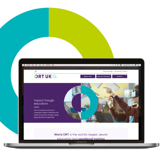
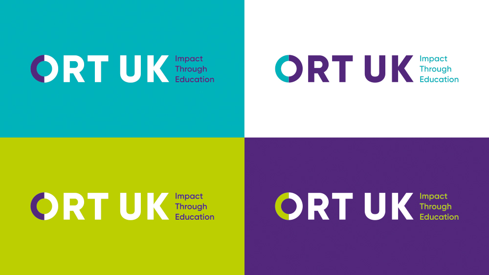
Israeli branding company FIRMA used this concept as the guiding principle to design a new stripped back logo. The ‘circle of ORT’ is two semi-circles joining together to complete each other as the two-toned O of ORT.
The shape represents ORT’s status as a global service provider and symbolises human connection, one universal globe and people uniting for a common good.
The Tagline
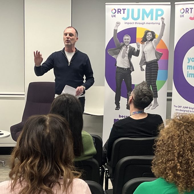
‘Impact Through Education’ reflects ORT’s mission to use education, driven by Jewish values, to effect positive change for individuals, for their communities and for the world at large. As they develop 21st century skills they will gain confidence and understand the social responsibility to use those skills for the greater good.
It covers the implicit story of ORT’s relevance today and tomorrow and harnesses the heritage of yesterday and the impact it delivers.
Colours and Style
A palette of vibrant and fresh colours express ORT’s pioneering spirit, passion and impact. The typography is clean, modern, crisp and confident — yet friendly. All of these design elements combine to create a distinctive identity for the ORT brand, whether appearing on a business card, notebook, conference room or a mobile app.